Color. One of the first aspects you notice about an artwork – the abundance and even lack of it. But, how much do you know about color? In this week’s “Technique Tuesday,” we will discuss color theory. Due to the complexities of the subject, we have decided to write two posts about color theory. In this post, we will introduce color theory, touch on some scientific facts, and then apply it to the works Principle Gallery displays.
What is it?
In the simplest of terms, color theory is the method of classifying colors based upon their interactions with one another and how we visually perceive them. Generally, colors are classified into “primary,” “secondary,” and “tertiary.” Primary colors are those that cannot be made through any combination, whereas secondary and tertiary refer to the number of colors combined from the primary colors. For example, secondary colors are defined by the mixture of two primary colors and tertiary colors are the combination of three colors (primary or secondary).
However, the colors placed in these classifications differ depending upon the means in which they are used — either through digital print media or more classical media, like painting. As a general consensus and what classical media typically follows, the primary colors are red, yellow, and blue. These three colors, or rather pigments, are the only ones that cannot be recreated using other colors. On the other hand, the primary colors for digital print media are cyan, magenta, and yellow. Since our gallery mainly carries paintings, we’re going to stick with red, yellow, and blue as our primary colors. But before we get into the artistic side of color theory, I wanted to touch on the scientific side.
Did you notice that the primary colors, no matter the media, are comprised of three colors? Well, it’s because humans are considered to be trichromats, meaning we can only perceive three colors and their combinations. Located behind our eye’s retina, we have these mechanisms called photoreceptors that absorb light in different intensities. To sum it all up, rods help us see in the dark and don’t really absorb light, while cones absorb most of the light and aid us in seeing our color system. For you animal lovers, the reason why certain animals can see in the dark is because they have more rods than humans (there’s a fun trivia fact).
It’s actually pretty interesting how the human brain functions in order to process light. Our eyes only have three cones that absorb the light of three specific colors – red, green, and blue (the reason why all electronic screens use red, green, and blue light rays to emit color). When two of these cones are stimulated, we are then able to see even more colors. And when all three cones are stimulated at equal rates, we are able to see white. Of course, when none of them are stimulated or there is no light, we see black.
But enough about science, let’s get back to art!!
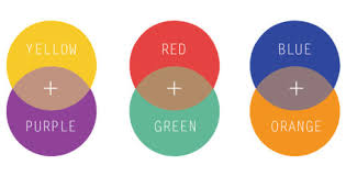
All of these colors can be paired together to create a fluid, coherent circle displaying the transition of one color to the next, which everyone knows as the color wheel. By analyzing the color wheel, we can see how colors complement one another and harmonize, or what is called color harmony. The epitome of color harmony is complementary colors – colors that pair well together and lie across from each other on the color wheel. For example, yellow is a complementary color of purple. For more information on color harmony and the different variations of color schemes on the color wheel, I highly suggest following this link – it goes into defining analogous, triadic, split-complementary, and many more color schemes! (Great to use for home decor, I would say!)
Using the color wheel below, we can also classify colors in a number of ways. If we were to split the wheel directly down the center, we are left with warm colors on the right and cool colors on the left. Warm colors tend to cause intense, energetic emotions and propel from space, while cool colors recede into space and evoke a somber feeling.
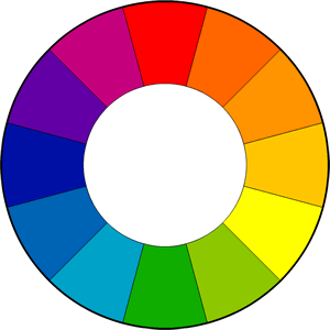
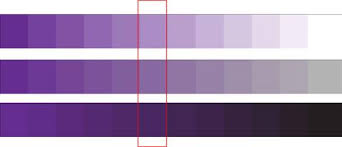
With this wide spectrum of colors also comes some terminology. The purest form of a color, meaning the color is derived from any category between primary and tertiary, is called a hue. Though white, black, and grey are not considered a color or hue, they are considered to be neutral because they are defined by the lack or presence of light. As soon as white is added to the hue, the color is a tint. When black is added, the color becomes a shade. And when both white and black (grey) are added, the color is considered a tone. All three of these techniques can be displayed within a scale, beginning with a hue and ending in the additive neutral color.
Examples at Principle Gallery
Though there are many Principle Gallery artists who utilize color in their works, Jeff Erickson‘s paintings exemplify the different aspects we have touched upon in this post. Without the distraction of a defined subject matter, Erickson’s abstract pieces are perfect examples illustrating the fundamentals of color theory.
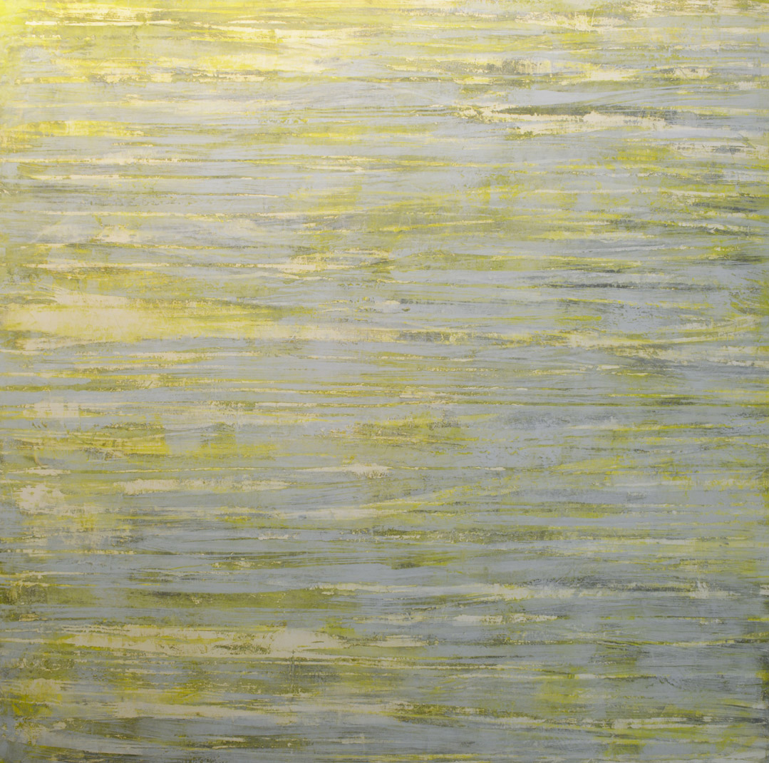
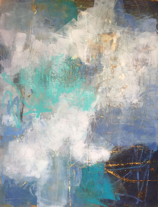
As an example, “Glimmering Light” displays a selection of cool greens and blues with strokes of warmer yellows. The cooler colors, as discussed before, seem to recede or lay flat in comparison to the yellows that advance in the space. Though not mentioned above, Erickson also illustrates an analogous color scheme, which is defined by the grouping of three adjacent colors on the color wheel. In this case, Erickson primarily uses the three dominant colors: yellow, green, and blue. Another instance where Erickson uses color theory as the basis to his works is “Whitecap.” Again, the artist demonstrates his understanding of analogous color schemes along with his comprehension of a hue’s tone scale, such as blue.
We hope you have the chance to view his works in person and apply what you’ve learned today during your next gallery visit! Please don’t hesitate to contact the gallery if you would like more information concerning Erickson‘s works or those by other Principle Gallery artists. And don’t forget, we will continue our discussion on color theory for our next “Technique Tuesday” – so stay tuned!
Written by: Haley Clouser, Gallery Assistant

One thought on “Technique Tuesday: Color Theory”