
When it comes to visual art, the most basic building blocks are known as the Elements and Principles of Design. The elements (line, shape, color, texture, etc.) are used by the artist in a particular way to create visual interest and harmony. These methods of using the basic elements are known as “principles.” Some examples of principles of design are proportion, pattern, and rhythm, but today we’re going to take a look a balance.
What is it?
Balance refers to the distribution of visual weight in a composition. What do we mean by visual weight? Essentially, something that draws the eye to a point in a painting would have visual weight. Many things affect visual weight, including size, color, value (the darker, the “heavier” the weight), position, islation, and more.
If an artist distributes the visual weight of their composition so that it is very similar on both sides (or on top and bottom), it is considered a work with symmetrical balance. If, however, the artist places contrasting amounts of visual weight throughout the composition of a work, it has asymmetrical balance.
Both types of balance can beautifully affect the way a work is viewed. Symmetrical balance often gives a sense of stillness, grandeur, or peace to a composition, while asymmetrical balance often adds a notion of movement, sharp focus, or whimsy to a piece. With any piece of artwork you see, take a moment to assess the balance and ask yourself why the artist might have placed the visual weight the way that they did, and whether it enhances the visual interest and harmony of the work.
Examples from art history:
Examples of both symmetrical and asymmetrical balance can be found in virtually every time period of art history. Take a look at some of these well-known artworks and the way the artist has used balance to enhance them.
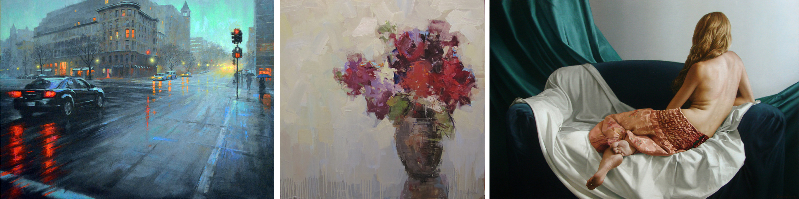
Here are some asymmetrically balanced works. Why do you think the artist composed them this way?

And here are a few examples of symmetrical balance:

As you can see, symmetrical balance doesn’t necessarily mean that the painting looks identical on both sides; rather, it refers to the distribution of the visual weight and the way that the eye reacts to the composition.
Examples from Principle Gallery:
Everywhere you look in the gallery, you’ll see excellent examples of both asymmetrical and symmetrical balance. Here are some great examples–
Asymmetrical balance:
Symmetrical balance:

There are also a great many beautiful examples of symmetrical and asymmetrical balance in this year’s solo exhibition by GC Myers, titled “Native Voice.”
GC Myers includes a lot of visual interest in each work in terms of color, line, shape, and texture, so the way that he uses balance is often especially important to the narrative of the work. Each landscape is filled with a sense of emotional depth, and often the way Myers has used balance makes this emotion even more poignant. Check out these gorgeous examples of work from Native Voice, and try to identify the type of balance used. To see the whole fantastic show, visit our website here!


